Customising Admonitions
This guide is made for beginners, by beginners, aiming to explain how Docusaurus uses HTML and CSS to create page elements. No prior front-end knowledge is needed!
When working on your Docusaurus project, you may not like the appearance of the default admonitions... If you are looking to override their color WITHOUT creating a whole new admonition, then you've come to the right place!
This page does not cover how to create custom admonitions, only overriding the default Docusaurus admonition appearance. If you want to create custom admonitions that DON'T interfere with the default admonitions, we have a guide for that: Admonitions
Background Knowledge
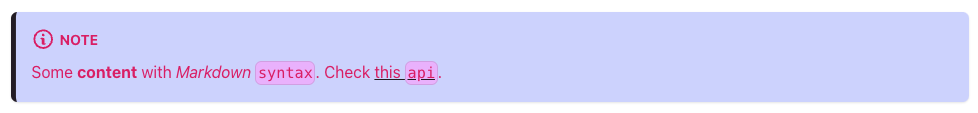
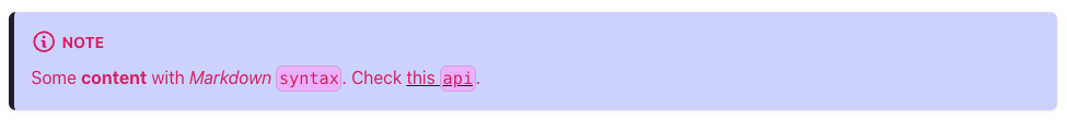
If you are unfamiliar with the Docusaurus admonitions and their appearance, visit the Docusaurus official documentation relating to admonitions by clicking the button below.
To understand how admonitions work, we need to utilize Inspect Element to find things such as HTML class names and CSS values that the admonitions use.
Using Inspect Element
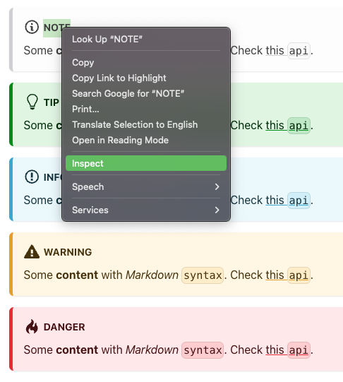
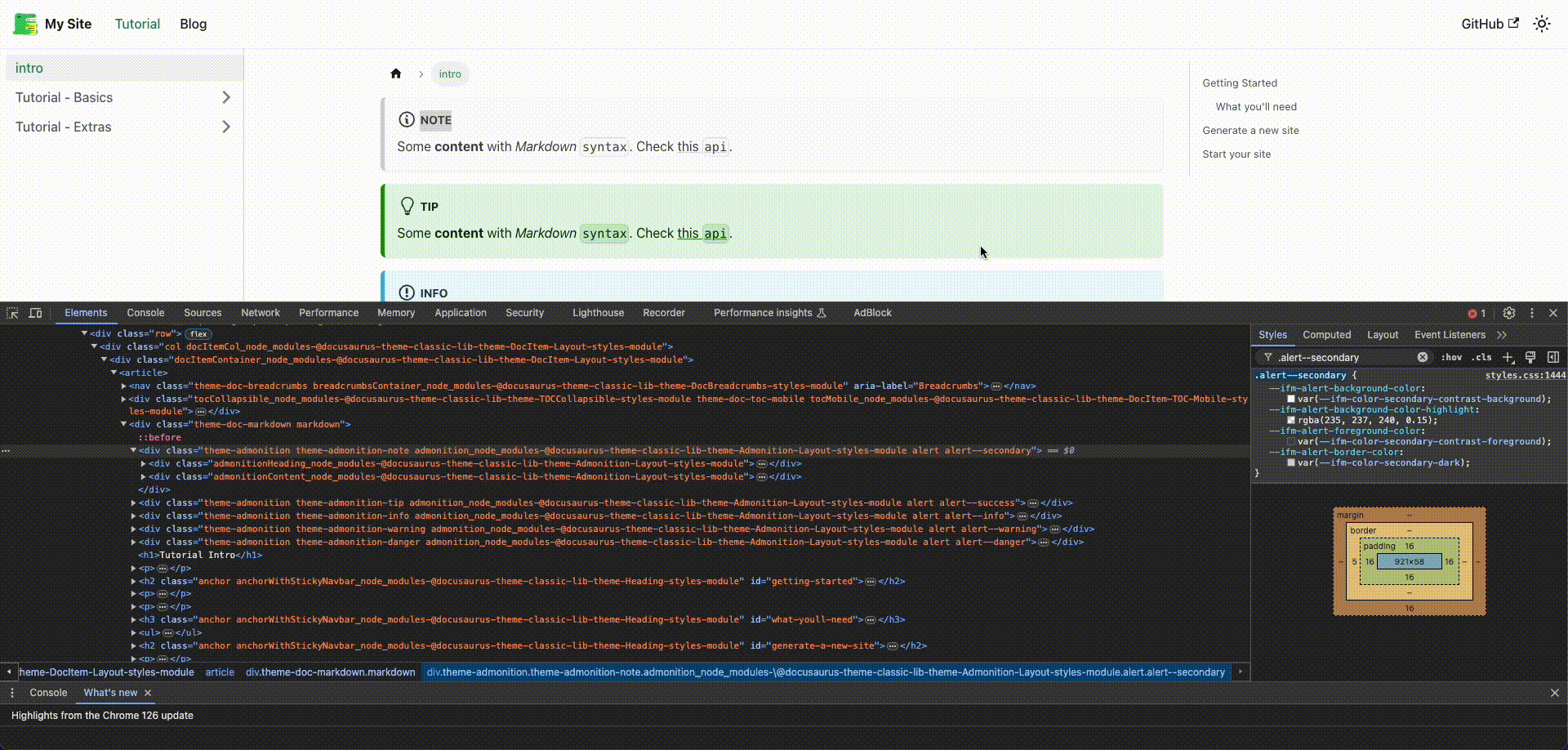
The best way to see how admonitions work (if you are using Chrome) is to highlight the title of the admonition, right-click, and select "Inspect." This will bring up Inspect Element. Inspect is key to figuring out how to override the appearance of the default admonitions.
If you want to make changes to any element of your website but find yourself stuck, Inspect Element is a powerful tool for making local, temporary changes!
From here, we can find the HTML of all the Docusaurus page elements. For this guide, we are only going to focus on the admonitions.
Analyzing the HTML (Using Inspect)
When clicking inspect on your site, you may find something like this:
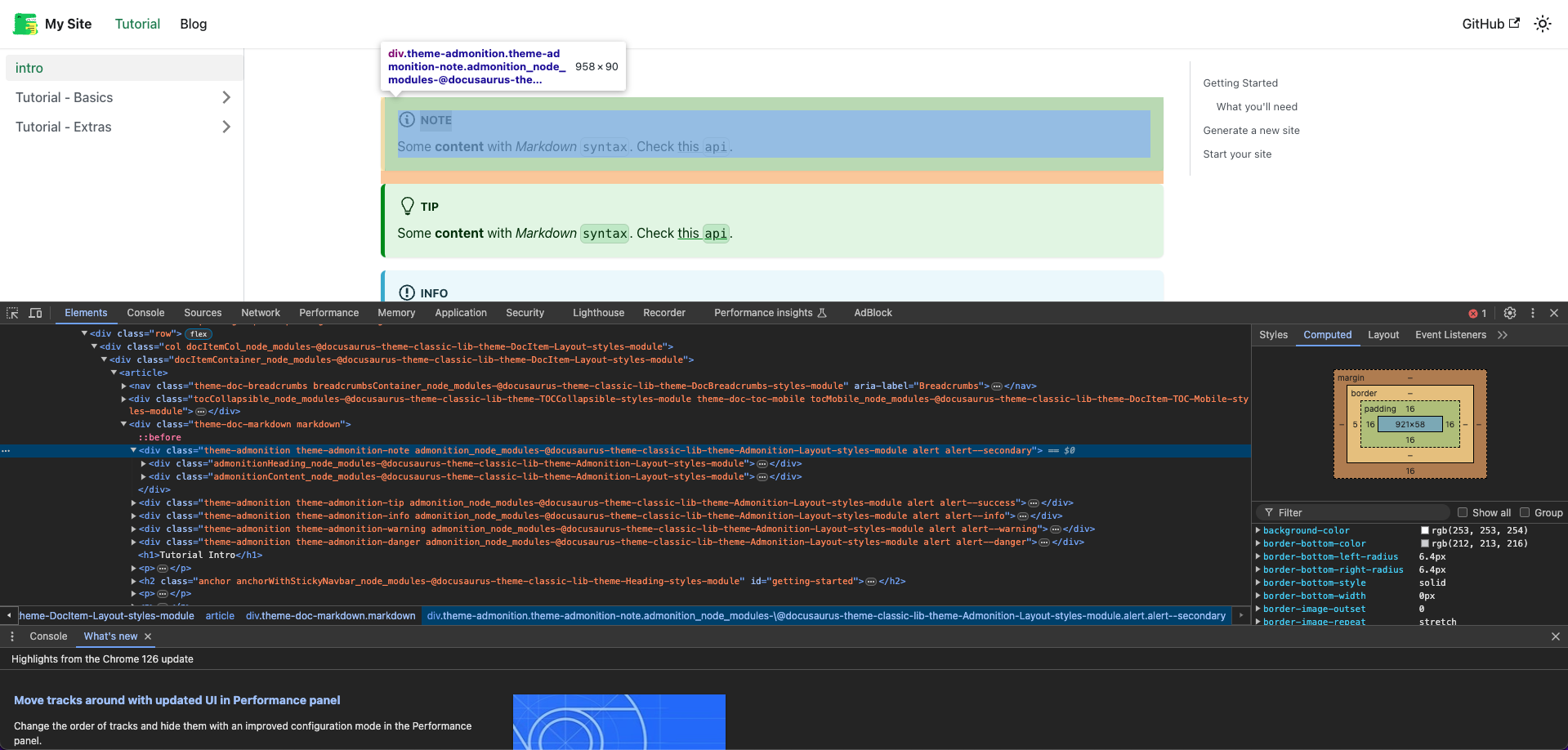
Don't be afraid! This is the HTML that Docusaurus generates to make your website!
If you click around in Inspect Element, you will eventually find the elements that
are the admonitions. We can see that the "note" admonition that we highlighted is
an HTML <div> element, with a couple of classes attatched to it.

For our purposes, we are interested in that last class: alert--secondary. This is
the driving class that tells the "note" admonition what colors to use. We can find what
variables it uses with Inspect Element as well. Switch to the "Styles" tab in Inspect Element
and use the search bar to find the "note" admonition's class: alert--secondary.
Analyzing the CSS (Using Inspect)
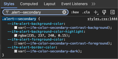
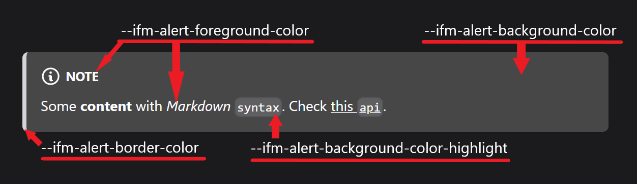
This is the note admonitions CSS code. This is what tells the note admonition what colors to use. We see four attributes and their corresponding default variables:
⭐️ Note admonition's default CSS Values
| CSS Attribute | Default Value |
|---|---|
--ifm-alert-background-color | var(--ifm-color-secondary-contrast-background) |
--ifm-alert-background-color-highlight | rgba(235, 237, 240, 0.15) |
--ifm-alert-foreground-color | var(--ifm-color-secondary-contrast-foreground) |
--ifm-alert-border-color | var(--ifm-color-secondary-dark) |
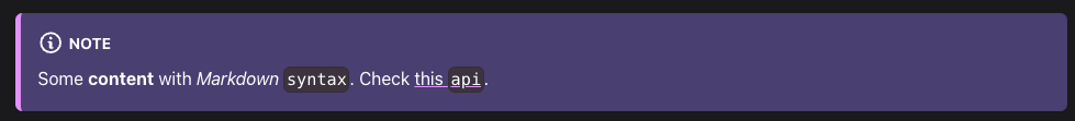
Let's say we want to override the background of the "note" admonition to purple. Well,
we can change the value using Inspect and see the color update in real time. Try changing
the value of --ifm-alert-background-color to any color!
All changes made using Inspect Element are temporary! Refreshing the page will revert any changes we made with Inspect.
Updating the CSS
Now that we know that the CSS is responsible for the appearance of admonitions, we need to update the CSS code of our Docusaurus site to override the default values to our new colors.
In your code editor, in the directory of your Docusaurus site, navigate to src/css/custom.css.
This is where we can add permanent overrides to the CSS of our site, which means we can update the
colors of our admonitions.
We want to make overrides to the alert--secondary (note admonition) class's CSS we found. Add the
alert--secondary class to your custom.css by copy and pasting the code below into custom.css.
.alert--secondary {
  --ifm-alert-background-color: rgb(237, 219, 255);
  --ifm-alert-background-color-highlight: rgb(235, 237, 240);
  --ifm-alert-foreground-color: var(--ifm-color-secondary-contrast-foreground);
  --ifm-alert-border-color: var(--ifm-color-secondary-dark);
}
Now, we can change the variables here to any color we desire! This next code block will override the "note" admonition's color to an example of colors.
.alert--secondary {
  --ifm-alert-background-color: rgb(210, 216, 255);
  --ifm-alert-background-color-highlight: rgb(233, 187, 255);
  --ifm-alert-foreground-color: rgb(216, 36, 111);
  --ifm-alert-border-color: rgb(38, 31, 41);
}
You can also define colors using hex values!
.alert--secondary {
  --ifm-alert-background-color: #d2d8ff;
  --ifm-alert-background-color-highlight: #e9bbff;
  --ifm-alert-foreground-color: #d8246f;
  --ifm-alert-border-color: #261f29;
}
⭐️ Admonition Class Names
Here are the names of all the default admonition classes:
| Admonition | Class Name |
|---|---|
| Note | alert--secondary |
| Tip | alert--success |
| Info | alert--info |
| Warning | alert--warning |
| Danger | alert--danger |
You can use these class names in custom.css to override their appearance as well, just
like how we did with the "note" admonition.
Making Color-Responsive Admonitions
You may notice that your new colors might not look good when your Docusaurus site switches from light mode to dark mode (or vice versa). In order to make our admonitions responsive to the color mode of our website, we can use custom CSS variables!
Make a Custom CSS Variable
First, let's make a custom CSS variable that will store any color of our choice.
In your custom.css, Docusaurus comes with a :root and a [data-theme='dark'] config by
default. You can name your variable anything you would like, just make sure it is descriptive
and fits your needs!
It is recommended you add a new config: [data-theme='light'], although, it is not
required, and all light mode variables can be put inside of :root. The guide will continue with
creating the new config for the light theme.
[data-theme='light'] {
  --note-bg: rgb(210, 216, 255);
}
Apply Custom CSS Variable
Now that we created our new color variable --note-bg, we have to apply it to the alert--secondary
CSS class. Update the static RGB value of .alert--secondary to our new variable, using var().
.alert--secondary {
  --ifm-alert-background-color: var(--note-bg);
  --ifm-alert-background-color-highlight: rgb(233, 187, 255);
  --ifm-alert-foreground-color: rgb(216, 36, 111);
  --ifm-alert-border-color: rgb(38, 31, 41);
}
Now, let's add a color for when the page is in dark mode. The procedure is very similar to the previous steps, excpt we are adding a new variable to the dark mode config!
[data-theme='light'] {
  --note-bg: rgb(210, 216, 255);
}

[data-theme='dark'] {
  --note-bg: rgb(83, 73, 126);
  // ...
}
Let's go ahead and set the colors of all our other parts of the note admonition. Here's an example:
[data-theme='light'] {
  --note-bg: rgb(210, 216, 255);
  --note-highlight: rgb(233, 187, 255);
  --note-foreground: rgb(216, 36, 111);
  --note-border: rgb(38, 31, 41);
}

[data-theme='dark'] {
  --note-bg: rgb(83, 73, 126);
  --note-highlight: rgb(68, 58, 72);
  --note-foreground: rgb(255, 255, 255);
  --note-border: rgb(226, 158, 255);
  // ...
}

.alert--secondary {
  --ifm-alert-background-color: var(--note-bg);
  --ifm-alert-background-color-highlight: var(--note-highlight);
  --ifm-alert-foreground-color: var(--note-foreground);
  --ifm-alert-border-color: var(--note-border);
}
Results
Now we can observe that the colors of our "note" admonition change between light mode and dark mode!
Conclusion
Congratulations! You are now a pro at overriding the basic colors of the "note" admonition! Using your knowledge, you should be able to override the colors of all the default admonitions using the class names listed above!
Use your new HTML and CSS knowledge to see what other elements of the webpage you can edit! Find
their class names, and tinker with them in your custom.css file, just like how you did with the
"note" admonition!